
Introduction
Color has the power to cultivate an emotional connection and evoke a reaction from its viewer. It is one of the most critical components of any successful design, be it for a brand, a website, or an advertisement. Understanding the psychology and impact of colors, hence, plays a pivotal role in determining the viewer’s perception and decisions.
The Importance of Color Design
Colors can stir emotions, generate feelings, and create experiences. Studies have shown that our brains prefer recognizable brands and color is a significant factor in this process. Color design can effectively communicate a brand’s values and message without using words. Different colors are associated with different feelings–while red may incite excitement or passion, for instance, blue can evoke feelings of trust and stability. Understanding these associations and meticulously selecting the right colors can give your brand an edge over its competition.

Creating Harmony with Colors
Harmony in a color scheme provides a sense of balance and orderliness, which can be pleasing to the spectators’ eyes. We usually create harmony by using analogous or complementary colors. The color wheel is an indispensable tool for designers envisaging harmonious color schemes.
The monochromatic scheme uses variations in lightness and saturation of a single color.
An analogous color scheme uses colors that are next to each other on the color wheel.
The complementary scheme stands for colors opposite each other on the color wheel.
Color Trends and Unforgettable Branding
Many brands have harnessed the power of memorable color schemes. Consider the instant recognition of McDonald’s golden arches, Starbucks’ green mermaid, or Google’s four-color typography. These successful brands are proof that impactful and consistent use of color can etch a design scheme in the minds of customers. For contemporary designs, simple color schemes with soft gradients are trending.
The Tools and Techniques for Color Design
Fortunately, we’re not left to our own devices to create color schemes. There’s a wealth of tools available to assist designers, including Adobe Color, Coolors, and Paletton. These tools empower designers to create, save, and edit their color schemes as needed.
Summary: Crafting Your Color Scheme
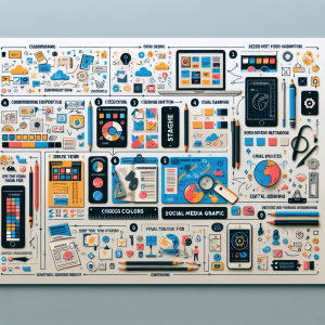
Here are the general steps designer usually follow to craft the color scheme:
Understand your brand’s personality and the emotions you want to evoke in your customers.
Research your competition – what colors are they using? You want to stand out and differentiate your brand.
Use the color wheel to create a balanced color scheme.
Experiment with the colors until you find a harmony you are content with.
Test your color scheme in a variety of settings to ensure it works well everywhere it might be used.

Conclusion
Color is more than just a visual aid; it is a form of nonverbal communication that can express meanings more effectively than words. It is an essential tool that designers use to influence mood, create an atmosphere, and unify a piece. Therefore, choose your colors wisely and create a color scheme that resonates with your brand’s personality and communicates your message effectively.


