Introduction
Graphic design can simply be defined as a communicative process that combines text and pictures to express a certain idea or message. A successful design is one that effectively communicates its intended message and generates a strong visual attraction. One of the ways to achieve this is through the proper use of contrast and balance. In this article, we explore these two important design principles.
Understanding the Basic Concepts of Contrast and Balance
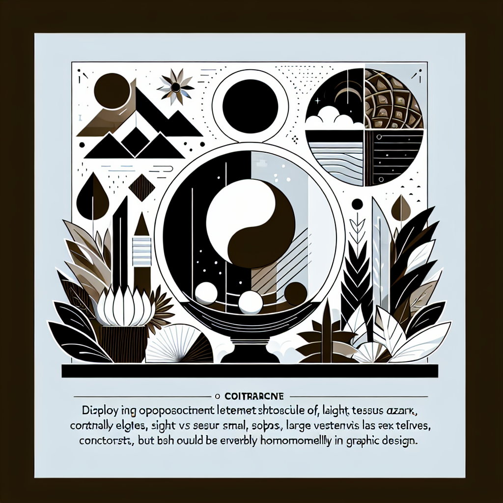
Contrast is a design principle that refers to the arrangement of opposite elements, such as light vs dark, thick vs thin, or modern vs classical in a piece of visual art. It creates a visual intrigue and helps to highlight certain parts of a design. Balance, on the other hand, refers to the distribution of visual elements in a design. It creates a sense of stability and coherence in a composition. Balancing contrasting elements effectively can result in a design that is visually compelling and harmonious.
Applications of Contrast and Balance in Design
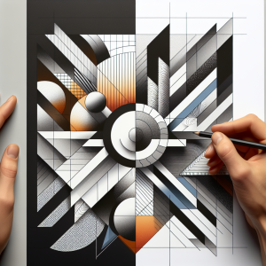
Applying contrast and balance in design is a skill that designers develop over time. Contrast can be applied in terms of color, size, shape, and typography. For instance, using a bright color against a dark background can instantly attract the viewer’s attention. The application of balance can be in terms of symmetry, asymmetry, or radial symmetry. A symmetrical design creates a sense of calm and order, while an asymmetrical design can create dynamic, flowing compositions. The aim should always be to create a visually compelling composition that attracts and retains the viewer’s attention.
 Case Studies
A practical example of contrast and balance in design can be found in movie posters. In the iconic poster for the film The Godfather, the designers used a strong contrast of black and white imagery and balanced the composition around the central figure, resulting in a powerful and memorable design. An analysis of such successful designs can provide invaluable insights into the application of these design principles.
Challenges and Solutions in Creating Contrast and Balanc
eCreating an effective contrast and balance in design can sometimes present challenges. For instance, the use of too much contrast can create a confusing and discordant design, whereas too little contrast can result in a bland and uninteresting composition. Similarly, balancing a composition without making it static and uninteresting can also be challenging. A solution to these challenges lies in training the eye to see and understand the dynamics of contrast and balance, and continuously experimenting and learning from the outcomes.
Conclusion
Contrast and balance are critical elements in graphic design. They create visual interest and help in the effective communication of the design’s intended message. The key is in understanding their fundamental principles and mastering their application in various design contexts. By doing so, designers can create artworks that are not only visually attractive but also communicate their messages effectively.
